Monday, 30 November 2015

Editorial


Editorial Illustrations are basically illustrations used to accompany and used as a visual summary for a piece of text, usually in newspapers, magazines and articles. 

With the first methodology, I had to create a small visual summary for an article called; “ If I don't see it, do I need to clean in, ask Oliver Burkeman”. 


And for this I'm going to be looking at using lightness and humour, trying to create a simple light-humoured cartoon illustration. 


For this i wanted to create a simple black and white cartoonish image with a clear image. In the article it says about how some people just don't see the mess, and therefore have no need to want to clean it. So i decided to illustrate a man sat on a sofa in a clean smart suit, surrounded by a messy room that he isn't bothered by. I wanted to keep it simple and not go too much into colour and detail, but I'm unsure as to whether the humour aspect is strong enough in this. But I don't think it impacts the overall message of it.


For the second methodology, I looked at conceptualising the abstract and sensitive. Looking at how to visually summaries sensitive topics which can be difficult subjects, such as peoples health, lifestyle and business.


I decided to look at the lifestyle subject, and found this editorial illustration by John Holcroft (1). He's illustrated what appears to be the ‘perfect kit’ to what people think they need nowadays in our current cultural environment to be happy. As you can see, a lot of the stuff is material objects.

I wanted to create something which shows how people sometimes live their lives. I chose to do something simple, showing the juxtaposition of different objects to create a whole new meaning. And chose to do a popular saying that everyone knows.


I then started looking at Eric Frasers work, and was particularly interested in his use of silhouettes and abstract, simplified styles.

I liked his piece, ‘Offshore Island’ (3) I was interested in his use of perspective along side the silhouettes. The silhouetted features, such as the trees and the person, are at the foreground of the image. And the deeper into the image you look the more there is grey tone used. 
I really liked how he's simplified the trees into abstract and almost creepy trees. 
So I tried to recreate his use of silhouettes and abstract shapes in my own way. 


I created this landscape scene with pen and ink like Frazer’s piece. I used the silhouette trees in the foreground and tried to abstract these to look even less like real trees. I also added some tone with the hilly background like he also does, both worked well.


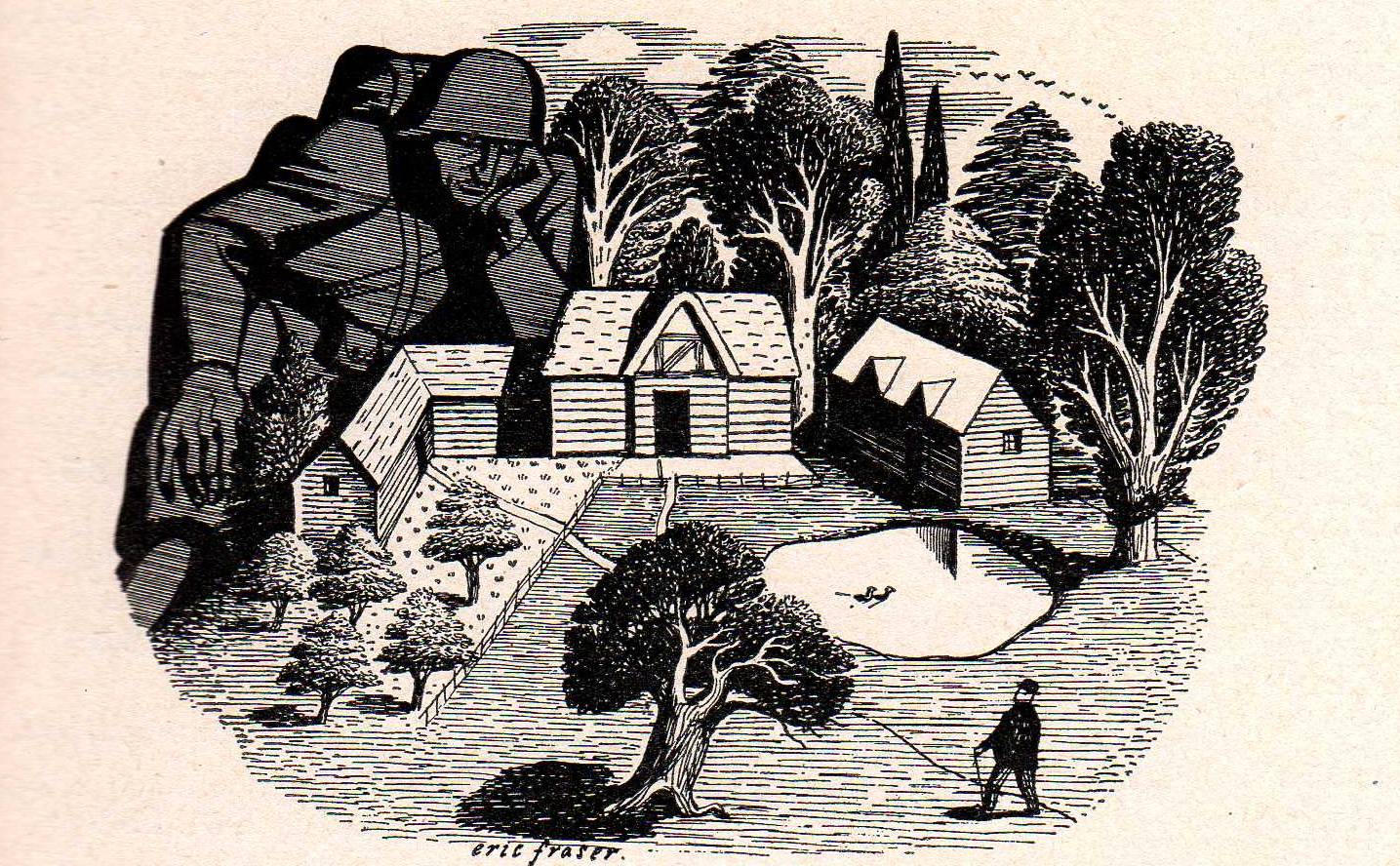
I wanted to then look further into  Fraser’s use of tonal effects within his black and white images, as well as using this to create texture. In this illustration (4) Fraser creates a lot of texture in the trees and the grass, giving it a more life like feel. He does this using his line work. The trees are a lot darker as well, and the houses are very un-toned making them stand out and be a clear feature of the illustration.


I chose to also do some houses in a landscape but instead of the big trees in the background, I chose to do mountains. I made these the darkest feature of the illustration and also shaded them using Fraser’s careful line work.  I also chose not to do the trees quite as toned as Fraser does as I wanted the mountains to be the darkest feature in my illustration. 


References 

(1) John Holcroft
(2) Mike Robbins, (2011)
(3) Eric Fraser, Offshore Island, (1959)
(4) Eric Fraser, (1939)


Bibliography 

Bellamy, F. (2012) ‘Eric Fraser in Lilliput’, Visual Rants, 30 January. Available at: https://standby4action.wordpress.com/2012/01/ (Accessed: 26 November 2015).

Fraser, E. (1959) Offshore Island [Pen and ink ]. .

John Holcroft illustrator www.johnholcroft.com (no date) Available at: http://johnholcroft.com (Accessed: 26 November 2015).

Robbins, M. (2011) Huffpost Healthy Living. Available at: www.huffingtonpost.con/mike-robbins/keep-your-head-in-the-clo_b_559814.html (Accessed: 26 November 2015).


Monday, 16 November 2015

Sara Fanelli


Sara Fanelli is a children's book illustrator with a unique style. One of her most used methodologies is, using photo collage of eyes onto creatures she's created. Like this piece Argus, from Mythological Monsters of Ancient Greece. (1) Throughout this book she creates creatures and adds photocopies of human eyes to add a recognizable element to her abstract drawings. This references avant-garde art, and its clear that she likes surrealist/surrealism art.


I had a go at drawing my own creatures or monsters and adding some eyes to them. With the first one I added some background detail and lines which she occasionally does as well. I made the creatures very simple shapes like she does, and just adding some eyes on top. 


Sara Fanelli is very influenced by collage and photomontage within the art movements, Dada, Surrealism, Cubism and Futurism. She also likes to “fuse the unconscious (the part of the human mind where memories and instincts are stored) with the conscious, to create a new "super-reality" - a surréalisme.”(2) This inspired her animals talking along side humans, and inanimate objects suddenly coming to life.“I have complete freedom in the way I want to express those ideas and in the degree of obscurity of the narrative.” (3)

I then went on to look at how she creates some of her other characters. In work like this one, Insects party from the book Dear diary. (4) Sara Fanelli collages lots of different aspects together to create these surrealist and unique characters. “I definitely love the element of accident and surprise which is a gift of the process of making images, especially in a relatively old fashioned technique like collage.” (5) Fanelli then went on to say how the playfulness of this technique with all the little surprises it creates really makes her enjoy it.


I tried to recreate this by doing the ‘Exquisite Corpse’ game, where you add parts of previous work together to see what kind of strange creature you create. I did this but its not in the exact style of children friendly creatures Sara Fanelli would design. I also did it on some scrap paper and doodled around it with symbols, type and little pictures as Fanelli would.

 I wanted to then look into Fanelli’s use of textural interest. In a lot of her illustrations she uses found bits of paper that add more depth and meaning to her work. In this piece within her book Dear Diary (6)
Fanelli connects with the reader by using old notebook styled paper which has its own connotations of previous life and other uses that the reader can then further relate to.“Everything in her collages has had a previous life. Sweet papers are crinkled and torn, newsprint is yellowed: every mark, every stain has its own story to tell, and she interweaves these stories with her own narratives.”(7) This gives her story even more meaning than what just the new illustrations may portray. 
“with the busy scribbles and notes that cover the graph paper inside this paper-over-board book's cover, Fanelli plunges readers into an enchanting community of committed diarists,” (8) Sara Fanelli is reaching out to something that most people have seen before or do everyday, as well as just adding more interest to her illustrations. 


I then created my own illustration like this, I recreated the old notebook style, with collaged flowers, grass and a butterfly on top. The use of collage of old paper I had, gives the same textural interest that Fanelli creates, as well as making a simple butterfly more interesting.  I also used some notes and scribbles on the page to complete the old notebook style.  


Sara Fanelli also likes to anthropomorphise unusual and unexpected things. She illustrates what its like to see life through these inanimate objects which delights children, and it is good “for exciting and nurturing any child’s imagination or indeed for thrilling older age groups to wake up, look again and never give up looking and thinking about their situation in life.” (9) 
Again it is clear to see Fanelli’s use of Surrealism, by almost creating a whole new look on the objects we use and see everyday. 


I recreated this, by anthropomorphising a table and chair. I did it in the same style and even added some writing in the background which she does in her diary book, referring to them as being a pair and aware of each other. I tried to keep the drawings simple and again added the eyes, which she uses to give the impression of the objects being more human and alive. 


References 

(1) Sara Fanelli, Mythological Mosters of Ancient Greece
(2) Andre Breton, Manifesto of Surrealism
(3) Steven Heller, An Interview with Sara Fanelli
(4) Sara Fanelli, Dear Diary
(5) Steven Heller, An Interview with Sara Fanelli
(6) Sara Fanelli, Dear Diary
(7) Joanna Carey, The Guardian
(8) Publishers Weekly, Dear Diary
(9) Carousel Guide, Sara Fanelli


Bibliography 

Breton, A. (1924) Manifesto of Surrealism,.

Carey, J. (2004) The guardian . Available at: theguardian.com/books/2004/apr/17/featuresreviews.guardianreview8 (Accessed: 12 November 2015).

Children’s book review: Dear diary by Sara Fanelli, author, Sara Fanelli, Available at: http://www.publishersweekly.com/978-0-7636-0965-8 (Accessed: 13 November 2015).

Collins, N. Art encyclopaedia . Available at: www.visual-arts-cork.com/modern-art-movements.htm#surrealism . (Accessed: 12 November 2015).

Fanelli, S. (2001) Dear diary. London: Walker Books.

Fanelli, S. (2002) Mythological monsters of Ancient Greece. London: Walker Books.

Heller, S. ‘An interview with Sara Fanelli’, pp, 5. Available at: http://www.hellerbooks.com/pdfs/varoom_03.pdf. (Accessed: 13 November 2015)

Heller, S. ‘An interview with Sara Fanelli’, pp, 3. Available at: http://www.hellerbooks.com/pdfs/varoom_03.pdf. (Accessed: 13 November 2015)

Publishers weekly, Available at: Www.publishersweekly.com/978-0-7636-0865-8 (Accessed: 12 November 2015).

Sara Fanelli (2013) Available at: carouselguide.co.uk/pdf/Carousel53-SaraFanelli.pdf (Accessed: 13 November 2015).


Tuesday, 3 November 2015

Chris Ware


Chris Ware is an illustrator cartoonist, with a very unique style. I'm not sure if I particularly like his style of work, but I do find it interesting.

To begin with I looked at Wares Quimby the Mouse(1). I found this piece very confusing and unusual as its not how you would usually read and convey a comic.

"Although Ware’s graphic novels always comprise a linear narrative, they are often interrupted by pages with quite unusual layouts, mostly complex patterns of panels connected by arrows that allow us to switch from one sequence to another."(2)  


I decided to try and make a series of events from the title 'I'm so bored, how can I get out of here?'. You can see this in the top left corner, with the three different outcomes. I tried to recreate Chris Wares style by having a series of stories that are linked with arrows, some with different outcomes as well. And then I tried to create another series of stories from 'What should I do today?' This time I linked the two stories so they overlap. 


Then I looked at another piece called Big Tex (3). This methodology is that it is one overall image but the square panels show different times. So as you can see, some panels show it in the past, and they show the scene in different seasons. The way he explores time in his comics is very different, as there is no rule that says every panel has to be seconds after the first one. "He controls every aspect of the page, how the story is told, and how the story is read."(4) This is something Chris Ware is particularly good at, and it gives this whole page a completely different meaning.  


I attempted to do this in my own way. I drew a park scene, with a house in the corner which shows it in different time frames, one being derelict and run down, the same as Chris Ware's. I also explored his use of seasons, and putting people in the scene in a certain time period. I wanted to use some muted colours and some bright colours like Ware did, but i think by using pencils it didn't emphasise this as much as I wanted, although you can still clearly see the different seasons.


I really like the simplicity and the certain almost robotic style to the way Ware draws people, and so i wanted to try and replicate this. I found his self portrait(5) seen above, and thought this was a good really stripped back version of his other drawings. I decided to use his methodology to try and create my own self portrait. 
I drew myself with his techniques, with the round eyes and nose, and the particular head shapes. As his has many personal features of himself like the glasses,hair and wrinkles, I decided to add in certain aspects of myself. I added my eyeliner I always have, and my piercings which I think help to give it the obvious look that it is me.

I also looked into how all his work has a depressive feel about it. And so I drew my self  portrait with how depression can effect you (not being able to talk to people, feeling like your in darkness etc). Again, I showed this with his use of arrows and small images displayed around.


Within his 'book' "Building Stories", Chris Ware showed multiple small comic strips about the everyday lives of the residents of the building. Some of these are these wordless strips, were just something small happens, like the image above. (6) He uses these short comic strips to try to recreate our little memories in the small day to day things that happen in our lives. (7)


I then tried this in my own way, using another every day task; going for a drink and a fag. I used the same layout that Chris Ware uses. I drew someone walking over to the bench in the first two panels, with the same view, and then showed her putting the fag and drink down in the last two zoomed in panels. I used the same block colouring, and the same angles. 
I think I used a good similar simple action to recreate this methodology. 


References 

(1) Chris Ware, Quimby the Mouse
(2) Bartual, R.(2012) p48
(3) Chris Ware, Big Tex
(4) Stamp, J.(2012)
(5) Chris Ware, Self Portrait
(6) Chris Ware, Building Stories
(7) Dueben, A.(2012)

Bibliography


Bartual, R. (2012) Towards a panoptical representation of time and memory: Chris Ware, Marcel Proust and Henri Bergson's "Pure Duration", Scandinavian journal of comic art, VOL 1:1 (Spring 2012) Available at: http://sjoca.com/wp-content/uploads/2012/06/SJoCA-1-1-Article-Bartual.pdf (Accessed: 3 November 2015). 

Dueben, A. (2012) Chris Ware explores ‘building stories’ Comic book resources . Available at: comicbookresources.com/?page=article&id=42098#storyContinued (Accessed: 3 November 2015).

Murray , N. (2003) Chris Ware: Quimby the MouseAvclub. Available at: Avclub.com/review/Chris-ware-iquimby-the-mousei-5527 (Accessed: 3 November 2015).

Stamp, J. (2012) Designing lives and building stories, Chris Ware’s comic book epic Smithsonianmag.com. Available at: smithsonianmag.com/arts-culture/designing-lives-and-building-stories-chris-wares-comic-book-epic-81172688/?no-ist (Accessed: 3 November 2015).