Editorial Illustrations are basically illustrations used to accompany and used as a visual summary for a piece of text, usually in newspapers, magazines and articles.
With the first methodology, I had to create a small visual summary for an article called; “ If I don't see it, do I need to clean in, ask Oliver Burkeman”.
And for this I'm going to be looking at using lightness and humour, trying to create a simple light-humoured cartoon illustration.
For this i wanted to create a simple black and white cartoonish image with a clear image. In the article it says about how some people just don't see the mess, and therefore have no need to want to clean it. So i decided to illustrate a man sat on a sofa in a clean smart suit, surrounded by a messy room that he isn't bothered by. I wanted to keep it simple and not go too much into colour and detail, but I'm unsure as to whether the humour aspect is strong enough in this. But I don't think it impacts the overall message of it.
For the second methodology, I looked at conceptualising the abstract and sensitive. Looking at how to visually summaries sensitive topics which can be difficult subjects, such as peoples health, lifestyle and business.
I decided to look at the lifestyle subject, and found this editorial illustration by John Holcroft (1). He's illustrated what appears to be the ‘perfect kit’ to what people think they need nowadays in our current cultural environment to be happy. As you can see, a lot of the stuff is material objects.
I wanted to create something which shows how people sometimes live their lives. I chose to do something simple, showing the juxtaposition of different objects to create a whole new meaning. And chose to do a popular saying that everyone knows.
I then started looking at Eric Frasers work, and was particularly interested in his use of silhouettes and abstract, simplified styles.
I liked his piece, ‘Offshore Island’ (3) I was interested in his use of perspective along side the silhouettes. The silhouetted features, such as the trees and the person, are at the foreground of the image. And the deeper into the image you look the more there is grey tone used.
I really liked how he's simplified the trees into abstract and almost creepy trees.
So I tried to recreate his use of silhouettes and abstract shapes in my own way.
I created this landscape scene with pen and ink like Frazer’s piece. I used the silhouette trees in the foreground and tried to abstract these to look even less like real trees. I also added some tone with the hilly background like he also does, both worked well.
I wanted to then look further into Fraser’s use of tonal effects within his black and white images, as well as using this to create texture. In this illustration (4) Fraser creates a lot of texture in the trees and the grass, giving it a more life like feel. He does this using his line work. The trees are a lot darker as well, and the houses are very un-toned making them stand out and be a clear feature of the illustration.
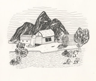
I chose to also do some houses in a landscape but instead of the big trees in the background, I chose to do mountains. I made these the darkest feature of the illustration and also shaded them using Fraser’s careful line work. I also chose not to do the trees quite as toned as Fraser does as I wanted the mountains to be the darkest feature in my illustration.
References
(1) John Holcroft
(2) Mike Robbins, (2011)
(3) Eric Fraser, Offshore Island, (1959)
(4) Eric Fraser, (1939)
Bibliography
Bellamy, F. (2012) ‘Eric Fraser in Lilliput’, Visual Rants, 30 January. Available at: https://standby4action.wordpress.com/2012/01/ (Accessed: 26 November 2015).
Fraser, E. (1959) Offshore Island [Pen and ink ]. .
John Holcroft illustrator www.johnholcroft.com (no date) Available at: http://johnholcroft.com (Accessed: 26 November 2015).
Robbins, M. (2011) Huffpost Healthy Living. Available at: www.huffingtonpost.con/mike-robbins/keep-your-head-in-the-clo_b_559814.html (Accessed: 26 November 2015).


No comments:
Post a Comment